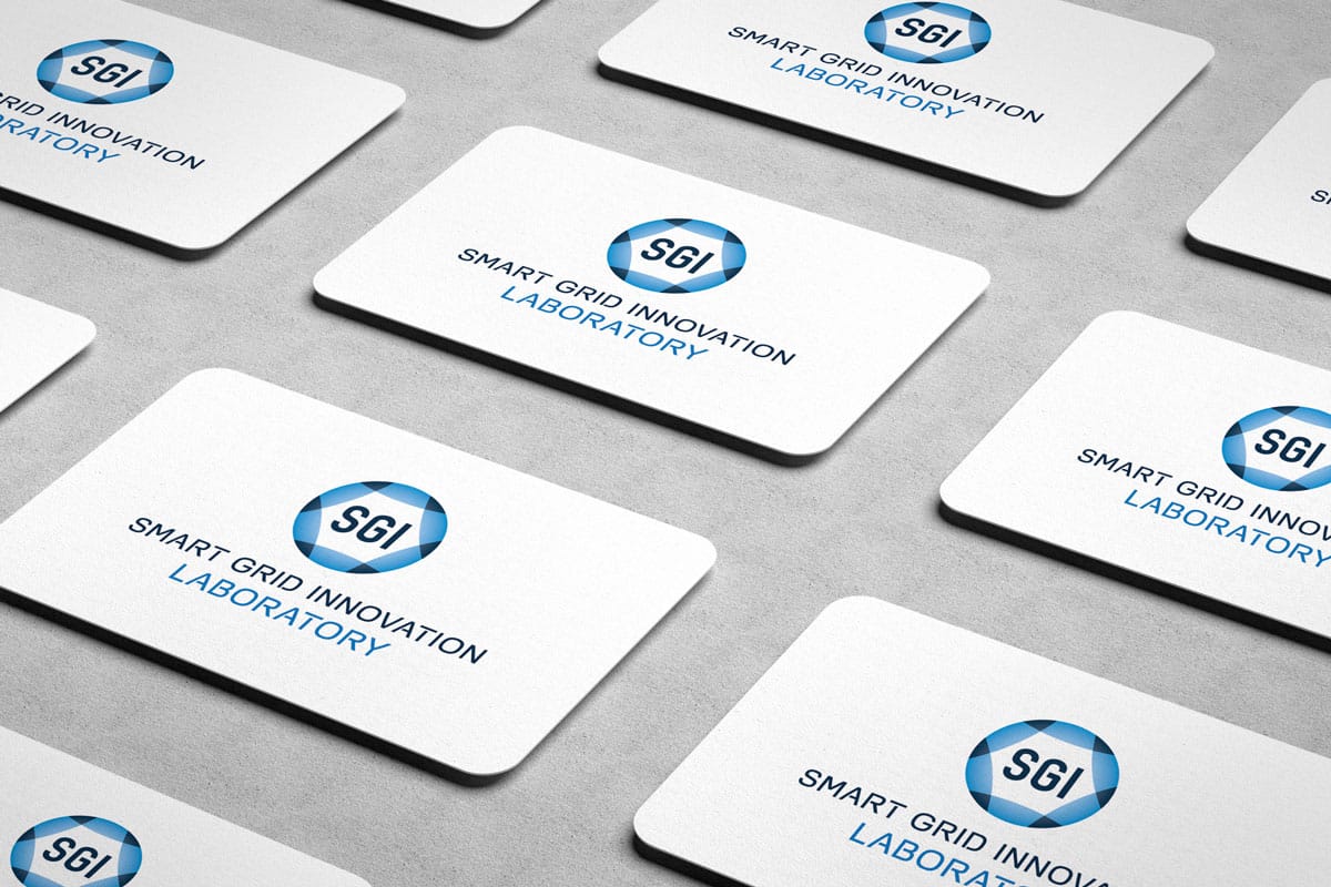
Smart Grid Innovation Laboratory
Logo design, colour palette, typography, style guide

“Robert’s design will give my new company a strong presence, and I’ll definitely hire him for more work in the future.”
– Yi-Ting Chou, PhD, Founder of SGI Laboratory

Organization
SGI Laboratory develops robust software and hardware solutions to integrate with smart grid applications. They provide dynamic energy management and power engineering with modular design and high computation efficiency.
Challenge
- Develop a logo and identity that expresses reliability, confidence, and professionalism.
- Try to capture the spirit of power engineering (being rigorous, robust, and practical).
- Use blue or green and avoid warm colors.
Solution
After exploring dozens of concepts and hundreds of iterations, I managed to make a shortlist of around 10 of the best ones, and then iterated some more.
Once I was down to 4 concepts, I showed them to the client with explanations and mockups for each. We did a little mixing and matching of the shapes and fonts to reach the final design direction.
The circular shape with overlapping arcs represents the robust smart grid with modular design. I chose to use subtle gradients in the two colours to give the mark more depth.
The tall font, Zag Bold, stands strong and confident in the center of the smart grid. And the second font, Foobar Pro Regular, reflects the project’s cutting-edge technology.


