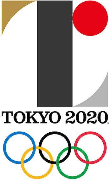
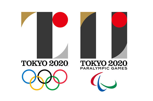
It must be quite an honor to design a logo for the Olympic Games. It could also be quite nerve-racking, knowing that billions and billions of people around the world will be seeing it. Of course, with any good logo, a lot of research, brainstorming, and creative experimentation is involved. I’m sure award-winning Japanese designer Kenjiro Sano went through the necessary design processes, too, when he designed the Tokyo 2020 Summer Olympics and Paralympics logos.
Here they are:


The emblems are flat, minimalist, and geometric—characteristics of classic Japanese graphic design. Given these traits, along with the unexpected gold and silver colour choices, they are certainly bold and memorable logo designs, and there is a great congruency between the two. The video does an excellent job of setting the stage for the logos. It shows how the two designs are constructed and come together as a pair, with shapes sliding around and into their right places. It also very nicely ties in the flat, geometric elements, superimposing geometric grid patterns onto live olympic video footage.
However…
Beyond this, these emblems are still pretty confusing. Now, I know that a logo designer cannot create a masterpiece every single time. Like with any craft, we all produce duds from time to time. I’m not calling these logos complete duds—seriously, they just need some tweaking. The original creative rationale, released by the The Tokyo 2020 Organising Committee, definitely left me scratching my head.
When the world comes together for Tokyo 2020, we will experience the joy of uniting as one team. By accepting everyone in the world as equals, we will learn the full meaning of coming together as one. The Tokyo 2020 emblems were created to symbolise the power of this unity.
The black colour of the central column represents diversity, the combination of all colours. The shape of the circle represents an inclusive world in which everyone accepts each other. The red of the circle represents the power of every beating heart.
These elements combine to create the emblems of both the Olympic and Paralympic Games.
The Tokyo 2020 Olympic emblem is inspired by the T in
TOKYO
TOMORROW
TEAM
The Tokyo 2020 Paralympic emblem is inspired by = the universal sign of equality.

What about the ‘L’ and the ‘r’?
Apart from the ‘T’, there also appears to be an ‘L’ and an ‘r’ in there, neither of which are mentioned by the committee. It seems the logo has now been challenged by the creator of Belgium’s Théâtre de Liège emblem. There is definitely a resemblance, and the ‘L’ is symbolic in that logo. Also, some have suggested that there’s a “20” that appears, maybe if you tilt your head to the left a bit. However, it looks more like a big “Z” to me.
Black represents diversity?
I don’t know about you, but when I think of diversity, I don’t think of black. Sure, I understand that in additive color mixing, black is the combination of all colors. But For me, that’s a bit of a stretch to throw that label on this neutral color. Besides, it’s not even a rich black; it looks to be an 80% gray. Actually, Tokyo’s interim logo for the 2020 Summer Games was a much better representation of diversity.
Here’s the real reason for the red circle.
They say that the circle represents an inclusive world and the red colour represents the power of every beating heart. That’s strange, because the red circle in the Japanese flag symbolizes the rising sun. You see, any poetic phrase could be paired with this red circle as a rationale. “An inclusive world” and “the power of every beating heart” are the types of rationales that are put to design elements after the fact. Let’s be honest, the Olympic logo has a red circle because the country’s flag has a red circle. There’s nothing more to be read into there.
Sorry, but the equals sign has never been vertical.
The committee says only one thing about the Paralympic emblem, that it’s “inspired by = the universal sign of equality.” Last time I checked, though, the equality sign was horizontal—and always has been since it’s invention in 1557. It’s not a stretch to say that two upright bars symbolize equality, it’s just not the “universal sign” that we all know.
And the font choice… yikes!
The other area I feel this design is lacking is typography. The main font is a classic British-style slab serif, similar to Clarendon. This particular style doesn’t allow any relevance to the icon. The secondary font chosen for “Paralympic Games” is a geometric sans-serif, similar to Gotham. The two fonts don’t work together in this display. Both fonts should have been sans-serif, preferably from the same family, using different weights. This modernity in type would have been a good contrast with the classical elements of the icon. Additionally, the words are set too close to the bottom of the icon. The whole type aspect just doesn’t sit right and takes away from the design as a whole.
Overall, they’re good, but could be better.
I don’t hate them. As mentioned above, the minimalism, geometric shapes, and colour choices make these Olympic logos bold and memorable marks. But, I feel that there are some important aspects that bring them down visually and symbolically. We’ll just have to see how the brand identity elements are played upon as 2020 approaches.
All trademarks and registered trademarks are the property of their respective owners.

